Communication is evolving. We talk on our phones, text our colleagues, and schedule email deployments to occur when we’re not there! Digital entertainment is changing too… and technology professionals are inventing ways to adapt their programs and applications to meet consumers’ changing needs. In particular, the plethora of digital devices (smartphones, touchscreen pads, laptops and more) have forced the need to create designs that adapt in real-time to different resolutions. Not only are the screens different physical sizes (widths and heights), but they also display a variety of ppi (pixels per inch) and dpi (dots per inch). Desktop computers, once a staple of homes and offices, are no longer the baseline user experience for digital media. Instead, the marketplace is a filled with a variety of different product manufacturers whose devices strain the limits of yesterday’s technologies.
Responsive Design is the latest and hottest technology that solves the problem of constantly zooming in and out of web pages. This new technique automatically adjusts to fit different screen sizes; whether the content is a data-filled table, a photo, or text. Now, all of these items fluidly realign themselves in a user-friendly manner. How? Programmers are using an entirely new coding language which leaves traditional design-thinking in the past. These newly-created pages are rendered in real-time responsive design, and are known as “context-aware” pages.
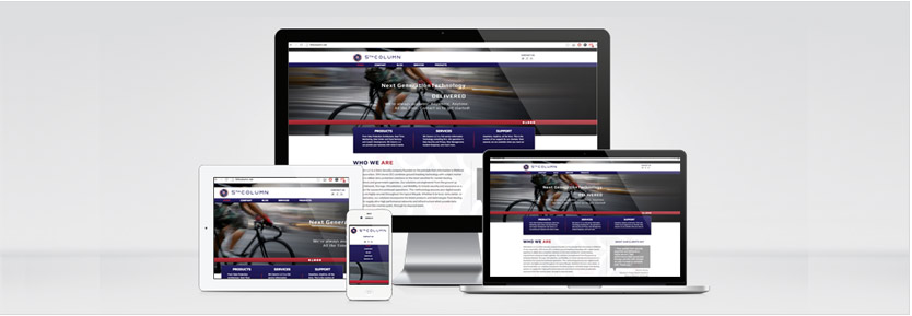
 This dynamic technology enables the instant transformation of a 4-column layout designed for a wide screen into a 1-column layout that renders perfectly on a smartphone – all on the fly! As a result, your site’s visual sharpness remains – with no visual damage to any content – and is perfectly readable on various digital devices.
Overall, Responsive Design advances fascinating new technology which ensures that Web sites look modern, while enjoying an increased access by the largest number of visitors. According to many web designers Responsive Design will become a mandatory - and expected feature – for virtually every Web site in the near future.
Recently ostpl WEB was charged with the task of creating a Responsive Design for a world-class data security company, 5th Column. Our client needed to project rock solid technology with unique services that range across network connectivity, large-volume data storage, virtualization and mobility. We combined all described techniques and released the website that covers all client needs. Just click on the link and play with it!
16 April 2013
Trendy: Responsive Web Design
 Design & Development