
With the first release of the Apple iOS, the company has actively used Steve Jobs' beloved skeuomorphism techniques.
Skeuomorphism is a design principle (for software, industrial products and more) which adopts the shape, general style or details of another object in the real world - which is already known and understood by most people.
Over the past 5 years iOS dazzled users with all sorts of reflections, shadows and textures which replicated the look of wood, glass, metal and leather. One example includes the story of Steve Jobs' inspiration by the interior design of a Gulfstream aircraft, during the creation of the iCal application's style.


The popular Game Center App was stylized after a typical Las Vegas casino table.
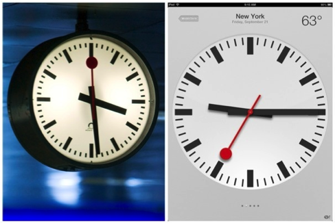 Apple's ubiquitous clock was copied from the Swiss federal railway station clock - originally designed in 1944 by Hans Hilfiker. The likeness was so similar that Apple had to pay $ 21 million in a lawsuit which proved copyright infringement.
Studies (and common sense) show that the majority of computer users like skeuomorphism. Thus, the recent introduction of a radically new design language has given birth to a wave of indignation among longtime fans. Nevertheless, Apple has never conducted surveys, has never created focus groups, and has always developed products according to the rule - "We know better how to do it right."
Both the iOS design department and Apple's senior designers debated the relevance of the old design approach that had produced such great results. Many were itching with the desire to create a modern design paradigm. The main supporters of skeuomorphism were Steve Jobs and Scott Forstall - both of whom enjoyed unquestioned authority during their tenure.
Following Jobs' death and Fosrtall's retirement, there were no more impediments, save the company's legacy, to the design department managers' implementing the changes planned long ago.

With the iOS 7 release, Apple has distinctly moved away from the lyric by creating simple and functional design elements. The abstracted visuals diminish influence from subjective tastes of color and style. The new design schema implies a thorough functional analysis, detailed organization of complex structures and the full convenience of functionality over myriad gadgets' while avoiding unnecessary decoration.
It will take some time before everyone who critiques the system for appearing "too bright" or "too android" gets used to the new look-and-feel of Apple's design elements. In fact, Apple is counting on the fact that users will cease missing the glare and textures; and will instead, begin complaining about third-party applications which don't comply with Apple's simplicity standards which offer a wide range of functionality.
Apple's latest move is neither a revolution nor a mistake. Instead, it was simply the right time for the nextevolutionary transition in design for communication.